Most first-time brand owners treat the logo as the last checkbox on a custom glass order. Pick a method, send the artwork, done. That assumption quietly costs money later, because the logo method decides how your brand survives daily handling on a retail shelf, how your artwork has to be drawn, and what the sampling round will actually show you.
Yes. Glass pipes can be branded by laser engraving, screen printing, acid etching, or sandblasting. Laser engraving gives the sharpest logos and serial numbers on borosilicate, printing adds full color, and etching or sandblasting produce a permanent frosted matte finish.
There is no universal best method. There is a right method for your artwork, your price position, and the way customers will touch the piece. This guide breaks down the three families of glass logo application — printing, etching, and sandblasting — so you can walk into an OEM conversation knowing which questions to ask. For the broader branding picture, our guides on custom glass pipe branding and five branding techniques for glass pipes cover the strategy side in depth.
Related reading: gold and silver accents.
Key Takeaways
- Screen printing delivers color coverage on flat or gently curved surfaces; the artwork must be separated by color
- Etching marks the glass surface itself for precise, single-tone artwork with a restrained look
- Sandblasting creates a frosted, tactile texture through a stencil — a finish customers feel as much as see
- Choose by artwork construction and handling, not by mockup beauty — verify on a production sample before committing volume
- OEM logo projects at Elfglass start at 100 pieces per design, with samples in 1–3 days and an NDA before any design exchange
Why the Logo Method Is a Brand Decision, Not a Finishing Step
Here is the mistake we see in early design conversations. A founder sends a full-color gradient logo and asks for it “etched.” Those are two incompatible requests, and the mismatch usually surfaces only at sampling — after days have already been spent. The method constrains the artwork. Printing reproduces color fields. Etching reproduces line precision. Sandblasting reproduces shapes as frosted areas. Each one translates your brand differently, and each one fails differently when the translation is wrong.
For more on this topic, see our guide on packaging design for glass brands.
The decision also shapes how your piece reads in a customer’s hand. A glossy printed logo reads as product branding — bold, commercial, visible from across a counter. A frosted sandblasted mark reads as craftsmanship — subtle, tactile, discovered at close range. Neither is superior. They position you differently, and your retail price story has to match whichever signal you send.
So treat the method choice as the first branding decision of the order, before color matching and packaging. Write down three things before you contact any factory: what your artwork actually contains, where on the piece the mark must sit, and how roughly the piece will be handled in its life. Those three answers will eliminate one of the three methods immediately and make the final choice obvious.
When the artwork is ready, walk into the conversation with our team with those answers in hand.
Screen Printing: Color Coverage on Flat and Gently Curved Surfaces
Screen printing pushes ink through a fine mesh stencil onto the glass. Each color in your artwork needs its own screen, applied in sequence and cured so the ink bonds to the surface. That mechanical reality drives everything else about the method.
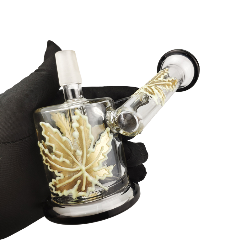
The strengths are immediate. Printed logos carry your exact brand colors, including multi-color marks and solid fills. Coverage looks crisp and opaque, which is why printing dominates retail branding where shelf visibility matters. If your logo is a bold two- or three-color mark with clean shapes, printing reproduces it faithfully.
The constraints follow from the stencil mechanics. Every additional color adds a screen and an application pass, so a six-color gradient logo is a fundamentally different job from a two-color wordmark. Fine gradients and photographic detail do not translate well; the method rewards simple, separated shapes. The surface geometry matters too — the mesh must contact the glass evenly, so flat panels and gently curved bodies take print well, while sharply curved or recessed areas fight the process.
The buying question to ask: is my artwork separable into a small number of solid colors? If yes, printing is live. If your mark depends on gradients, shadows, or photographic effects, expect the factory to redraw it into printable separations — and approve that redraw carefully, because it is where brand drift sneaks in.
Etching: Precise Marks With a Restrained Voice
Etching marks the glass surface itself rather than laying material on top of it. The result is a permanent single-tone mark that lives in the glass — thin lines, fine type, and detailed monograms reproduce with a precision that surface printing cannot chase. The look is quiet by nature: an etched logo whispers, and that restraint is exactly what premium positioning wants.
Because the mark is cut into the surface, etching tolerates artwork with fine detail — hairline strokes, small serifs, intricate emblems. It also sits well on curved surfaces where a printing stencil would struggle to keep contact. Where etching gives ground is color: your mark renders in one tone, defined by contrast against the glass. If brand recognition for you depends on a specific color — think a distinctive red or green that customers spot from across the shop — etching cannot carry that job alone.
The buying question to ask: does my logo survive as a one-color drawing? Take your mark, flatten it to pure black on white, and look at it hard. If it still reads instantly, etching is a strong candidate. If it loses its identity without color, etching alone will underdeliver your brand.
Sandblasting: The Frosted Texture Customers Feel
Sandblasting propels fine abrasive at the glass through a stencil of your logo. Wherever the stencil is open, the abrasive frosts the surface; wherever it is protected, the glass stays clear. The outcome is a matte, textured mark with real depth — you can feel the boundary between frosted and polished glass with a fingertip.
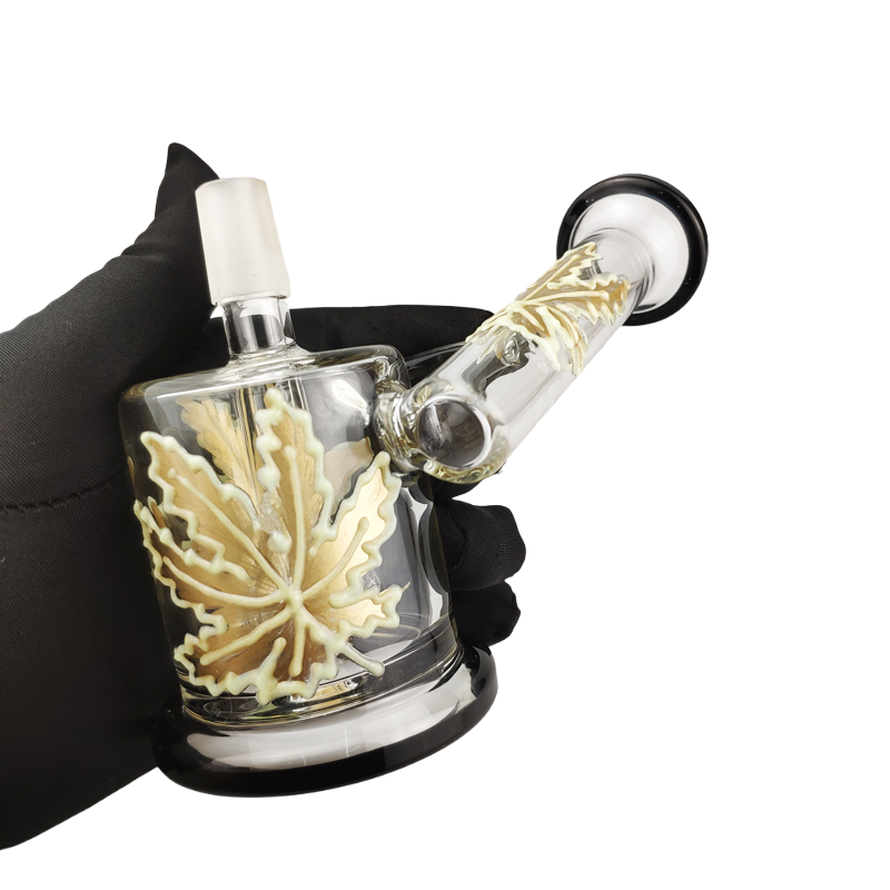
That tactility is the whole pitch. A sandblasted mark turns your logo into a sensory detail — something a customer discovers while turning the piece in their hands, which is precisely the moment purchase decisions happen in a head shop. The aesthetic leans premium and understated: frosted texture against clear glass, no ink, no gloss.
The constraints are the stencil’s. Sandblasting works in shapes, not hairlines. Very fine lines and tiny text can blur or break up because the stencil needs enough body to survive the blasting. Bold shapes, solid glyphs, and simple emblems frost beautifully; delicate filigree does not. Like etching, the finish is single-tone — the contrast comes from texture, not pigment.
The buying question to ask: can my logo be reduced to bold shapes without losing recognition? Bold wordmarks and simple symbols are ideal. If your mark is fine-lined and ornate, ask the factory whether a simplified blast version would still read as your brand — some marks adapt, some do not.
Printing vs Etching vs Sandblasting: The Decision Comparison
The three methods side by side, judged on the dimensions that actually drive OEM decisions:
| Dimension | Screen Printing | Etching | Sandblasting |
|---|---|---|---|
| Color | Full brand colors, multi-color | Single tone | Single tone (frosted) |
| Artwork fit | Solid shapes, separated colors | Fine lines, small type, detail | Bold shapes, solid glyphs |
| Look and feel | Bold, commercial, visible | Precise, restrained | Tactile, premium, matte |
| Surface geometry | Flat to gently curved | Handles curvature well | Areas that take a stencil |
| Best for | Color-driven retail brands | Fine emblems, subtle premium marks | Sensory premium positioning |
Read the table through the lens of your end customer, not your personal taste. A printed mark in two or three bold colors wins wherever shelf visibility drives the sale. An etched mark wins wherever the piece sells on refinement and close inspection. A sandblasted mark wins wherever the buying moment is tactile — the customer holding the piece, feeling the frost, and associating that texture with your name. You can see how these options fit into a full OEM workflow, from first sketch to delivery, on our customization process page.
One honest caveat about comparisons like this: any durability ranking you find online flattens too much. How a logo wears depends on how the piece is handled, cleaned, and stored — not on the method name alone. That is why the decision rule here ends at sampling: approve the method on a real production sample, handled the way your customers will handle it.
Turn Your Concept Into Production-Ready Glass
Elfglass takes you from design brief and CAD/STEP files to prototyping, branding, and mold exclusivity, with your IP protected by NDA. Send us your concept and we will return a manufacturable plan and quote.
MOQ from 100 pieces | BSCI / WRAP / ISO 9001 | NDA before every project
Matching the Method to Your Brand Scenario
Decision rules are more useful than opinions. Walk through the scenario that matches you:
- A new retail brand launching its first 100-piece run — your logo carries specific brand colors and needs shelf pop. Printing is the natural starting point; keep the mark to a few solid colors so the separations stay clean.
- A premium line extension — you already sell well and want a higher-tier piece. Etching or sandblasting signals craftsmanship without shouting; choose etching for fine detail, sandblasting for tactile presence.
- A logo with both color identity and fine detail — split the job. Print the color mark where the surface allows it, and reserve etching for the detail element; ask the factory at sampling whether a combined approach suits the piece geometry.
- A minimalist wordmark brand — a bold wordmark reads well in all three methods, so decide by budget posture and positioning: printed for visibility, frosted for feel, etched for precision.
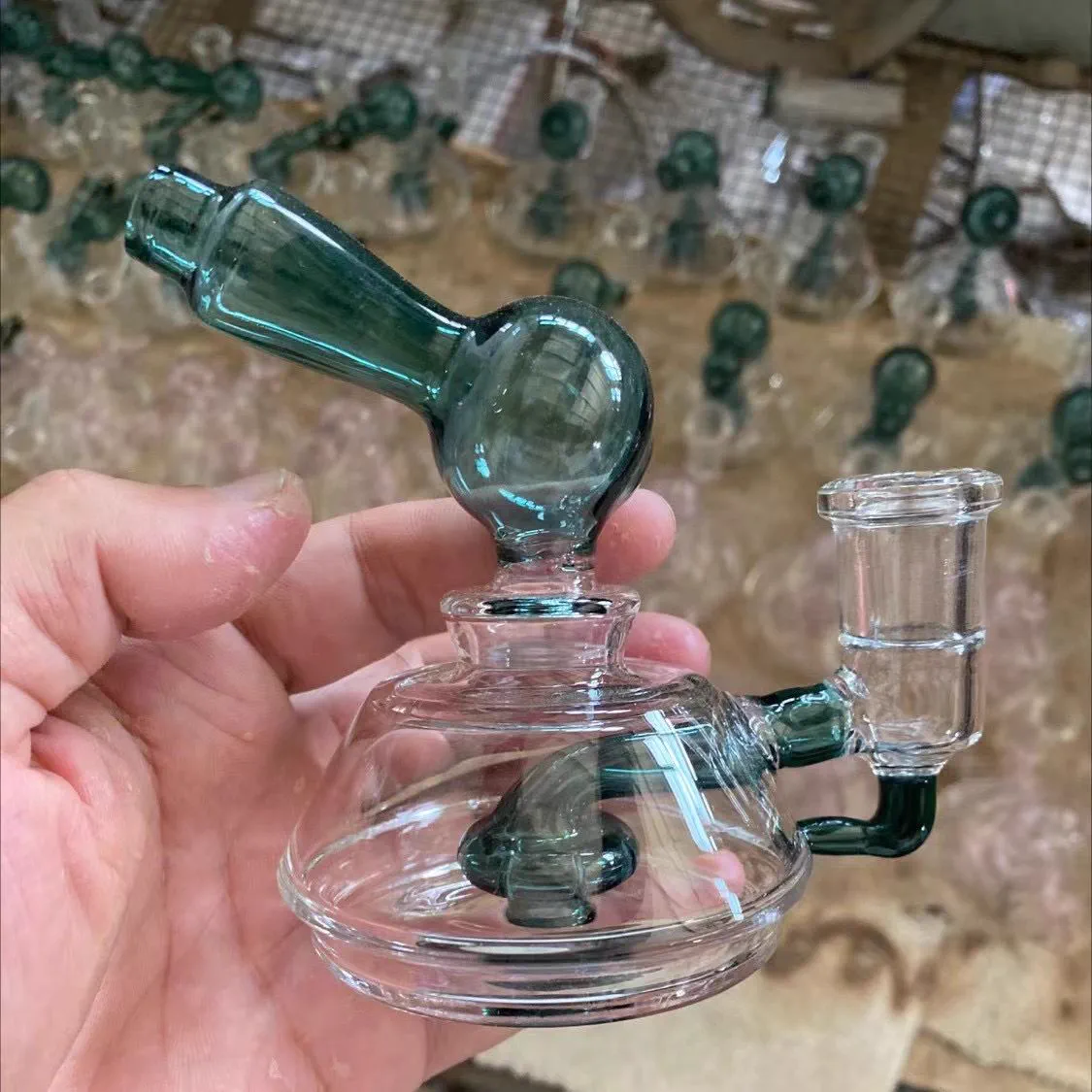
Whichever scenario you land in, the verification step is identical: see it on glass, in the real method, before volume. Mockups on a screen lie about texture, scale, and contrast. If you are still choosing between building your own label and reselling existing lines, our guide on private label vs white label sets up that bigger decision first — logo work only matters once you have chosen a branded path.
Ordering Logo Work From an OEM Factory
With the method chosen, the order itself follows a tight sequence — and this is where choosing a real OEM manufacturer changes the experience. When design questions come up during that process, learning to handle design revisions with empathy keeps the project moving forward. At Elfglass, custom logo projects start at an MOQ of 100 pieces per design, which keeps a first branded run small enough to test the market without overcommitting. The sampling round takes 1–3 days, so the loop between your approval and a physical sample stays short. For orders of 100 pieces and up, bulk production runs about 7–12 days.
The paperwork matters as much as the timeline. An NDA is signed before any design files change hands — your logo and artwork are your brand equity, and they should never travel on a promise. That design-first mindset runs through everything we build; read the Elfglass factory story to see how a designer’s approach shapes every OEM project from concept to shipment. An NDA is only the first layer of that defense; our guide to protecting your product design IP when sourcing overseas explains the NNN agreements, design registrations, and evidence trails that complete it. Quotations come back within 12 hours, which means a stalled project is a choice, not an accident. Payment follows the standard structure: 30% deposit by T/T to start production, 70% balance before shipment.
Behind those terms sits a factory established in 2010 — 16 years of export work serving 50+ countries, with BSCI, WRAP, and ISO 9001 certifications in the file, and a monthly capacity above 10,000 pieces across 300+ SKUs. Your 100-piece logo run rides inside that production system rather than interrupting it, which is exactly why the 1–3 day sampling promise holds.
See Your Logo on Glass Before You Commit
MOQ 100 per design, samples in 1–3 days, NDA before design exchange, quotes within 12 hours.
Preparing Your Logo Files for the Factory
File preparation is where brands lose days. The same goes for the product itself: if your project includes a custom shape, our guide to the design files factories need (CAD, STEP, or sketches) covers what to prepare alongside the logo assets. Send this set and the engineering conversation starts immediately:
- Vector artwork (AI, EPS, SVG, or vector PDF) with fonts converted to outlines — vectors scale cleanly to any piece size, bitmaps do not
- A pure one-color version of the mark, which is what etching and sandblasting stencils are built from
- Exact color references for any printed elements, so the separation conversation starts from your specification instead of a guess off a JPEG
- The intended placement on the piece and an approximate mark size — a logo drawn for packaging rarely lands at the right scale on glass
If all you have is a bitmap, say so up front. The factory can redraw the mark as vectors, but that redraw is a design decision in disguise — approve it line by line before it becomes a stencil, because fixing a wrong redraw after tooling costs days.
Inspecting Logo Quality Before You Accept the Shipment
Logo defects hide in consistency, not in the first piece. The sample you approved looked perfect; the question is whether piece 87 matches piece 1. Build these checks into your pre-shipment inspection:
- Registration — on multi-color prints, colors must sit exactly aligned; any halo or overlap shows the screens drifted
- Edges — printed marks should have clean boundaries, etched lines should be continuous, and frosted areas should have sharp stencil edges without bleeding
- Uniformity — the frost density on a sandblasted mark should read evenly across the batch; patchy frost means inconsistent blasting
- Comparison to the approved sample — hold a production piece next to your signed-off sample under the same light; deviations you can see now are cheaper than deviations your customers find later
Ask for batch photos of the logo stage before packing, the same way you would request packing photos before a container ships. A factory confident in its decoration work produces these images without friction.
Conclusion: Which Method Fits You
The honest summary is scenario-shaped, not method-shaped. If your brand lives on color recognition and shelf visibility, print it — keep the artwork to clean, separated colors and approve the factory’s redraws carefully. If your brand sells on refinement and your mark carries fine detail, etch it and let the precision speak quietly. If your buying moment is the customer holding the piece and feeling something unexpected, sandblast it and let the texture carry your name.
Two rules hold across every scenario. First, decide by artwork construction and handling, never by mockup beauty — the screen lies about texture and scale. Second, no volume order before a production sample in the real method: with sampling in 1–3 days and an MOQ of 100 per design, the cost of verifying is small, and the cost of skipping it is a hundred pieces wearing the wrong face of your brand.
Frequently Asked Questions
Which glass logo method lasts the longest?
There is no single answer that survives contact with reality. Etched and sandblasted marks alter the glass surface itself, while printed marks live on the surface and meet friction directly. How any logo wears depends on how the piece is handled and cleaned — so verify your specific logo on a production sample under realistic handling instead of trusting a generic ranking.
Can I combine two logo methods on one piece?
Combinations are possible — a sandblasted emblem beside a printed wordmark, for example — but every added method is an added process stage with its own alignment and sampling questions. Bring the idea to the factory at the sampling stage and let the piece geometry decide what is practical.
What artwork files does the factory need for a glass logo?
Vector artwork with fonts outlined, a one-color version of the mark for etching or sandblasting stencils, exact color references for printed elements, and the intended placement and size on the piece. If you only have a bitmap, the factory can redraw it — approve that redraw before any tooling happens.
Does the logo method change the MOQ for a custom order?
The MOQ stays at 100 pieces per design regardless of method. What changes with the method is the sampling conversation: multi-color prints need separation approval, and etched or blasted marks need stencil confirmation. Samples land in 1–3 days either way.
How do I check logo quality before accepting a shipment?
Check registration on multi-color prints, edge sharpness on all marks, frost uniformity on blasted areas, and hold a production piece next to your approved sample under the same light. Ask for batch photos of the logo stage before packing so consistency is documented, not assumed.
Get a Quote for Your Next Order
Planning a custom run? your logo and branding method, quoted with samples? Send your design files and target quantity to our factory team or message us on WhatsApp — we will reply with a feasibility check, pricing, and production timeline within 24 hours.
About the Author
Ava Zeng is the founder of Elfglass, a Shenzhen-based borosilicate glass pipe manufacturer serving B2B brands worldwide. Every guide on this site is grounded in her production-floor experience— the annealing lines, QC checkpoints, and export orders behind each claim.
Before you commit to a supplier, read her founder’s story and trust promise, and the guide to vetting a reliable glass pipe manufacturer— the same red-flag checklist Elfglass applies to its own suppliers. For more context, see this OEM vs ODM manufacturing models.
Application methods follow the logo reproduction standards, where ink adhesion, durability, and color accuracy determine which technique fits the brand.
Ready to Source Custom Glass Pipes?
Get a free quote within 24 hours. MOQ from 100 pieces. NDA-protected design consultation.
